Business owners must do more to help their brands stand the test of time. Gone are the days of developing a useful product and providing excellent customer service as the only components of longevity.
Case in point: visual branding.
If you’re wondering what the heck visual branding is and why you need to add it to your business model, you’re in luck. I sat down with visual branding guru Tina Wolfe of Tina Wolfe Creative Business Solutions recently to talk about all things visual branding.
Tina provided some valuable insights any size business can use to influence how their brand shows up in the marketplace. Check out her tips then reach out to her for any projects that require her expertise.
What the heck is visual branding?
I know what you must be thinking. So many marketing terms, so little time. Why must you throw one more at us, Shari?
If you’ve been reading my blog for any amount of time, you already know I’m not a fan of jargon. All industries have unique lingo that drives the common folk mad. Since I’m all about providing useful information my readers can understand and apply to everyday situations, I avoid jargon like most people avoid meetings that could have been an email.
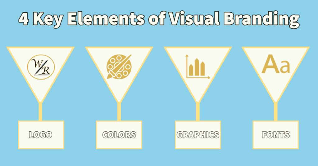
Visual branding – sometimes called visual identity – is simply the fancy way of describing how you build your brand’s presence through visual imagery. There are four key elements of visual branding:
- Color palette.
- Fonts and typography.
- Graphic design and imagery.
- Logo.
The trick is to be consistent with your visual branding so it can pull all your messaging together into an easily recognizable format. Every post you make on Facebook, every newsletter or sales ad you print, is a chance to incorporate your visual branding. If you do it correctly, your customers can find you in a crowd of competitors.
Now that you know what visual branding is, let’s break down how to do it the right way with some handy tips from Tina.

Branding vs. visual identity: what’s the difference?
Sometimes marketing professionals use these terms interchangeably. That’s a big no-no and can be confusing for the uninitiated.
Branding and visual identity are two different things. Creating a strong, positive perception of a company’s products or services is branding. It includes communication strategies, brand archetypes, and values. Think of it as that one thing that sets your business apart from every other business out there.
Visual branding promotes the consistency of your brand through visual elements like colors, fonts, images, and logos. Plating these visual clues in every piece of content produced helps customers quickly and easily identify it with your brand.
Here’s a simpler way to describe the difference between the two. If branding is the bridge to your ultimate customer, then think of visual branding as the paint for that bridge.
“Visual branding is really just an extension of branding,” said Wolfe. “It takes it one step further and lets you do so much more with your ultimate customer.”
How is a visual identity used?
Before you can create a visual identity, you must familiarize yourself with all the ways it can be used across different platforms. Among the most common places businesses use visual branding include:
- Brochures.
- Digital and print ads.
- Clothing and other wearables.
- Packaging.
- Websites.
It can be tricky to create visual branding that translates well across all mediums. It’s best to work with a visual branding professional who can guide your business through the process. Experts like Wolfe achieve consistency in visual design by defining the visual standards of a brand and creating brand guidelines.
How do brands create a visual identity?
When working with clients, Wolfe uses a questionnaire to help identify the core values that define all aspects of a business.
“How do you, as a company, want to show up in the world? What is the most important thing to your business? Is your business service-minded? All these things come into play when you’re looking at crafting both written messages and the visual around those messages to attract your ultimate customer,” Wolfe said. “It’s just such a simple thing. It tells your audience that you care about how you run your business because you’re putting that attention to detail in all aspects of your business.”
Identifying the ideal customer
She also takes her clients through the customer identification process. Some marketing professionals use what’s known as an ideal customer avatar. Wolfe said she dislikes using that terminology because customers are real people that are best served when businesses keep that in mind during the visual branding process.
Regardless of what you call it, the process is the same. It creates a deep dive into the person behind a brand’s ideal customer to identify all the characteristics that make someone an ideal customer.
“Who is your customer? Who are you serving? What’s important to them? Why do they want your product? Why do they need your product?” are some of the questions Wolfe said she asks her clients during the visual branding process. The answer to these questions helps Wolfe craft a visual representation of a client’s brand.
Problem-solving with visual branding
Visual branding works best when it solves a problem, Wolfe said. Coca-Cola is an example of a company that has nailed the problem-solving aspect of its visual identities. You can find the company’s logo, color palette, signature font and imagery in every piece of content it produces.
Moreover, Coca-Cola creates marketing campaigns that are pure visual identity genius, featuring their products as the solution to everyday problems.
Take this ad produced for the 2021 holiday season. It takes problem-solving to a whole new level. The ad is chock full of visual identity, including a Coca-Cola box that puts the finishing touch on a community effort featured in the ad.
“Every time you see the Coca-Cola symbol or a bear at Christmas time, you know that’s a Coca-Cola commercial,” Wolfe said. “You automatically identify it.”

What visual elements make a brand stand out online?
As previously mentioned, there are four key elements of visual branding. Let’s break each of them down and talk about their importance to a well-rounded visual identity.
Color palette
Colors evoke emotional responses. Warm colors like red can represent anger or hostility, while cooler tones like blue and green promote feelings of calm and relaxation. Before you choose a color palette to represent your brand, you must decide what emotions you want to provoke in your target audience.
Once you decide on colors, you must be consistent with their use in all digital and printed materials for your brand. Logos, advertisements, and website banners must all incorporate your colors.
Most people choose one main color and then form the rest of the palette around it. You can do this by choosing darker or lighter shades of the same color or complementary colors.
Fonts and typography
Fonts and typography are important components of your visual identity. Any graphic designer worth their salt explains this to their clients before they create a logo or a banner for a website. Big, block lettering exudes stability and strength. Swirly scripts tend to denote elegance and tradition.
Headers should be distinguished from body copy in digital and print media. The key is to choose fonts and typography that bring a balanced look and feel to your brand.
Graphic design and imagery
Graphic design elements like icons, patterns, shapes, and textures can add dimension to your visual branding. They can be used on websites, social media platforms, and even printed marketing materials. Be sure to use your color palette and fonts and typography in any design elements for consistency.
Illustrations and photos are part of this category. Custom graphics and photos must represent your brand voice. Custom illustrations should use your color palette when possible. A well-placed logo within an illustration also is advisable.
When choosing photos, make sure the objects, people, and places within the photo communicate the right message. Marketing pros call this “on-brand” visual messaging. For instance, if you’re a travel agent focused on exotic locations, choosing imagery that clearly illustrates some of the cool places you can send your clients would be on brand.
Logo
Logos are arguably the most important visual branding item in your toolkit. All other elements should be shaped around your logo.
Wolfe said one of her first clients – a chamber of commerce – had a logo but nothing else. While the logo was recognizable by everyone in the community it served, most people couldn’t explain the purpose of the organization.
She took that logo and created a visual branding package around it by adding a color palette, fonts, a stylebook, and a visual branding guide for their logo. “Everything we put out was then consistent with their mission statement and brand. When people saw a billboard, they knew that it was the chamber of commerce. When people saw a flyer, it was designed in such a way that it was obvious that the chamber was behind it.”

How does visual branding enhance the customer experience?
Every company strives to build trust with its target audience. After all, loyal customers refer your products and services to others, helping to grow your base.
Some of the other ways visual identity improves the customer experience include:
- It boosts first impressions. Brands have as little as a tenth of a second to make a first impression. All graphic design and imagery should contribute to a positive impression by paying attention to detail and displaying pleasing aesthetics.
- It increases engagement. Illustrations and videos are key components of visual branding. Social media posts that included these design aspects performed better.
- It makes your brand more relatable. Behind every brand are living, breathing people who work hard to provide a quality product or service. Featuring the faces behind your brand helps your target audience connect with you on a whole new level.
“In any business, consistency is important,” said Wolfe. “Consistency tells the customer that you’re trustworthy.”
Tools for creating your visual branding
“Canva is a great tool for business owners with small budgets who want to incorporate visual branding,” said Wolfe. “When you’re a small business owner, you’re wearing all the hats. Canva can help with creating basic visuals for all your marketing campaigns.”
Businesses can choose between a Canva free or pro account. User-friendly tools like a drag-and-drop editor and access to more than a million free graphics and images can make visual branding affordable.
Another tool Wolfe recommends is Buffer for social media management. Like Canva, it has a basic free option, plus three other plans at increasing price ranges. Businesses can prepare and schedule social media posts consistent with their visual branding to maintain consistency. Use Canva to create the graphics, then schedule them in Buffer.
Need more help with visual branding? Reach out to Wolfe today to schedule a hassle-free consultation.


1 thought on “How to Do Visual Branding Right”